Table Of Content
Understanding Responsive Web Design
In today’s digital world, where nearly 60% of users access websites and apps through mobile devices, 30% on desktops, and 10% on iPads, responsive UI design and best practices are more critical than ever. Ensuring that your interface seamlessly adapts to different screen sizes and resolutions is essential for providing a consistent and enjoyable user experience across all platforms. In this post, we’ll explore practical responsive UI examples and best practices , helping you create interfaces that look great and perform flawlessly on any device. Having a website that effortlessly adapts to various screen sizes is a necessity, not just a luxury. This is where responsive web design becomes crucial.
So, what is responsive web design exactly? Let’s explore!
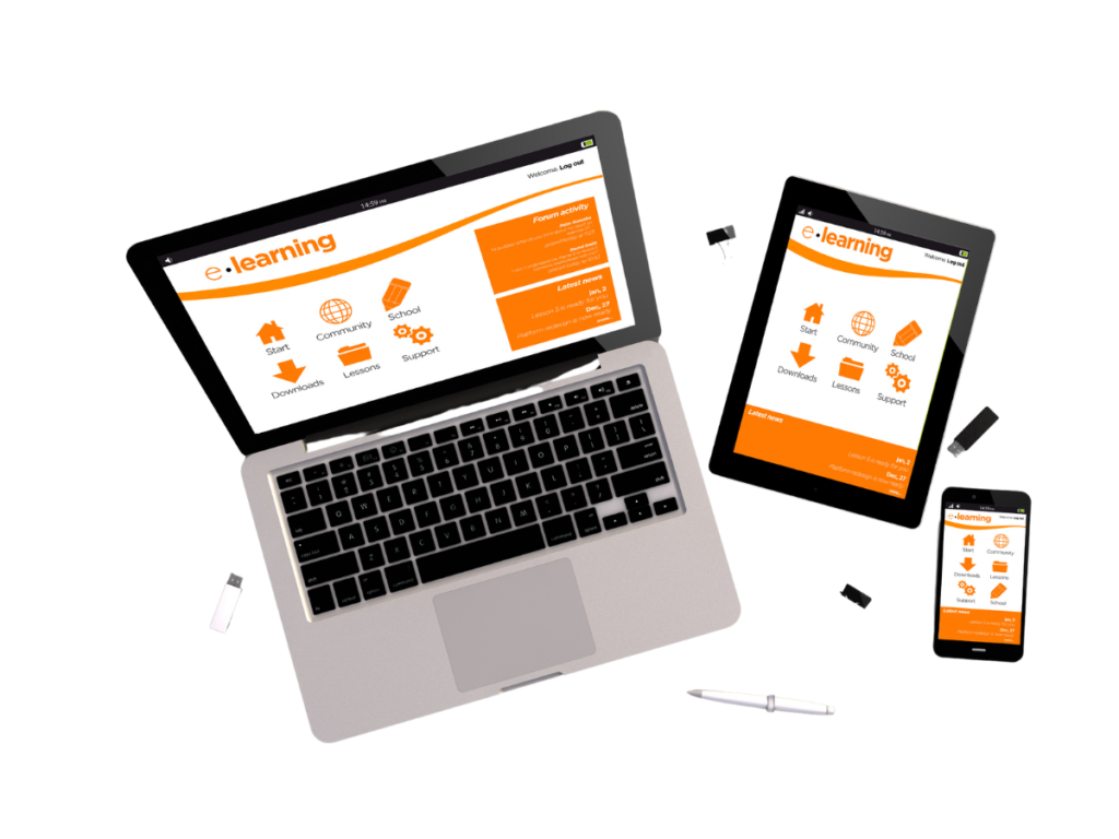
Responsive web design is a method of web development that ensures a website functions and appears optimally across all devices, from large desktop computers to small smartphones. Think of it like a chameleon that changes its colour to match its surroundings; similarly, a responsive website adjusts to the screen size to provide the best user experience. This design philosophy allows web pages to fluidly adapt to different screen sizes and resolutions, ensuring users have an optimal viewing experience.
UI stands for User Interface. It refers to the space where interactions between humans and machines occur, particularly in software and devices. The UI encompasses everything a user interacts with, including buttons, icons, menus, and other elements that facilitate the user’s experience. The goal of UI design is to make these interactions as intuitive and efficient as possible, to ensure a smooth and enjoyable user experience.
Responsive Web Design vs. Mobile-First Design

Both responsive web design and mobile-first design aim to provide excellent mobile experiences, but they approach this goal differently. Responsive web design creates a single website that flexibly adjusts to various screen sizes, while mobile-first design prioritizes the mobile experience, starting with smaller screens and then scaling up for larger devices.
The primary distinction between responsive web design and mobile-first design is as follows:
Responsive Web Design:
1. Begins with designing for larger screens (desktops and laptops).
2. Adapt the design to fit smaller devices (tablets and smartphones).
Mobile-First Design:
1. Starts with designing for smaller screens (mobile phones and tablets).
2. Scales up to accommodate larger screens (laptops and desktops).
Typically, mobile-first design is more focused on core user experience, whereas responsive design often offers greater flexibility and efficiency. Your audience’s preferences should guide the choice between the two approaches. If most of your traffic comes from desktops, responsive web design may be more suitable. On the other hand, if mobile traffic dominates, a mobile-first approach might be more effective.
The Foundation of Responsive Web Design

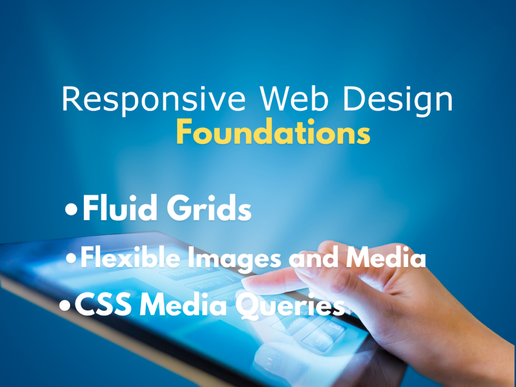
Responsive web design is built upon three fundamental principles:
Fluid Grids: These adaptable layouts ensure content remains accessible and readable on different screen sizes by using flexible measurements in HTML.
Flexible Images and Media: Images and other media elements resize proportionally to fit the screen without losing quality.
CSS Media Queries: These powerful CSS tools allow designers to apply specific styles based on various screen sizes, orientations, and device characteristics, ensuring smooth transitions between different layouts.
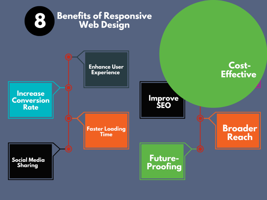
Top 8 Benefits of Responsive Web Design

1. Enhanced User Experience: A responsive website eliminates the need for users to pinch, zoom, or scroll excessively, offering a smooth experience across devices.
2. Improved SEO: Search engines favour mobile-friendly websites, and responsive design plays a crucial role in achieving higher rankings.
3. Increased Conversion Rates: A superior user experience often leads to higher conversion rates, whether it’s making a purchase, filling out a form, or subscribing to a newsletter.
4. Cost-Effective: Maintaining a single responsive website is more cost-efficient than managing separate sites for desktop and mobile.
5. Faster Loading Times: Optimized images and efficient code contribute to faster load times, enhancing user satisfaction, retention, and search engine rankings.
6. Broader Reach: As more people access the internet via mobile devices, a responsive website helps you reach a larger audience.
7. Social Media Sharing: Responsive websites are more likely to be shared on social media, further expanding your reach.
8. Future-Proofing: As technology evolves and new devices emerge, a responsive website is better equipped to adapt without needing a complete redesign.
How to Test a Website’s Responsiveness
Testing your website’s responsiveness is vital to ensuring it performs well across all devices. Here’s how you can do it:
Browser Developer Tools: Modern browsers, such as Chrome, offer built-in developer tools that allow you to simulate different screen sizes.
Responsive Design Testing Tools: Online tools like Responsinator and Google’s mobile-friendly test can provide a quick overview of your website’s appearance on various devices.
Testing on Real Devices: Checking your site on actual devices gives the most accurate assessment of performance and user experience.
Manually Resize Your Browser: You can manually resize your browser window to observe how your site adjusts.
Key Takeaways on Responsive Web Design
Responsive web design is no longer optional; it’s essential for businesses that want to succeed in the digital era. A well-crafted responsive website can significantly boost your business’s online presence and overall success. By focusing on user experience, improving SEO, and increasing conversions, you can create a website that not only looks great but also delivers results.
Remember, investing in a responsive website is an investment in the future of your business. It’s a commitment to providing the best experience for your audience, regardless of the device they use. So, make sure to adopt a strong responsive design to stay ahead of your competitors.
Examples of Responsive Web Design in Action from Popular Brands
Responsive web design has become a critical element of successful online platforms. Let’s look at how six leading brands have mastered responsive design and the essential role of fluid grids, media queries, and flexible images in achieving this.
Case Studies in Responsive Excellence
1. Amazon:
Desktop: An extensive interface with multiple product categories and search options.
Mobile: A streamlined layout that prioritizes product search and checkout, with easy navigation.
Key Elements: Amazon’s responsive design employs a fluid grid to adapt product listings and search results to different screen sizes. Media queries adjust the layout for smaller screens, prioritizing key information. Flexible images ensure product images look sharp on any device.
2. Apple:
Desktop: A sleek, minimalist design with large, high-quality product images.
Mobile: Focus on product highlights, with clear call-to-actions and easy navigation.
Key Elements: Apple’s website utilizes a fluid grid to maintain a consistent layout across devices. Media queries optimize the display of product images and text for different screen sizes. Flexible images preserve image quality while adapting to various dimensions.
3. Nike:
Desktop: An immersive experience with large hero images and product showcases.
Mobile: A simplified layout emphasizing product categories and athlete stories.
Key Elements: Nike’s responsive design uses a flexible grid to accommodate different screen sizes. Media queries adjust the layout and content hierarchy for mobile devices. Flexible images ensure product visuals are vibrant on smaller screens.
4. Netflix:
Desktop: An extensive content library with personalized recommendations.
Mobile: A streamlined interface focused on browsing and playing content.
Key Elements: Netflix’s responsive design employs a fluid grid to adjust the layout of movie posters and information. Media queries optimize the video player for various screen sizes and orientations. Flexible images ensure clear thumbnails on all devices.
5. Airbnb:
Desktop: Detailed property listings with multiple photos and amenities.
Mobile: A simplified search and booking process with an emphasis on key property information.
Key Elements: Airbnb’s responsive design uses a fluid grid to adapt property listings and maps to different screen sizes. Media queries optimize the layout for mobile devices, prioritizing essential details. Flexible images ensure high-quality property photos on smaller screens.
6. Spotify:
Desktop: A vast music library with playlists and artist profiles.
Mobile: Focused on music playback and discovery, with a streamlined interface.
Key Elements: Spotify’s responsive design utilizes a fluid grid to adjust the layout of music playlists and artist information. Media queries optimize the music player and navigation for different screen sizes. Flexible images ensure album covers look sharp on all devices.
The Importance of Fluid Grids, Media Queries, and Flexible Images
To achieve the seamless transitions between desktop and mobile experiences seen in these examples, three key elements are essential:
Fluid Grids: These provide the structural backbone, allowing content to rearrange and resize gracefully as screen sizes change.
Media Queries: These CSS tools enable designers to apply specific styles based on various screen sizes, ensuring optimal layout and content display.
Flexible Images: Images are resized proportionally to fit different screen sizes without sacrificing quality, maintaining visual appeal.
Mastering these techniques as a web designer will enable you to create websites that not only look great but also deliver exceptional user experiences across all devices, helping businesses stay ahead of the competition.
Responsive UI Design Examples And Best Practices

Responsive UI Design: Examples and Best Practices
1. Fluid Grid Layouts
- Example: Bootstrap framework uses a 12-column fluid grid system that adapts based on the screen size. Content resizes and repositions automatically for different screen resolutions, providing a consistent user experience.
- Best Practice: Use percentage-based widths instead of fixed widths to ensure that elements resize proportionally. This approach maintains the design structure across various devices.
2. Flexible Images and Media
- Example: The Boston Globe website adjusts its images according to screen size, ensuring they are not cut off or distorted.
- Best Practice: Implement CSS properties like
max-width: 100%andheight: autofor images. This ensures that images scale with their containing element without overflowing or losing aspect ratio.
3. Media Queries
- Example: Apple’s website uses media queries to load different stylesheets based on the user’s device screen size. This makes the content look polished on desktops, tablets, and smartphones.
- Best Practice: Utilize media queries in CSS to apply specific styles based on device characteristics such as screen width, height, or orientation. This allows for fine-tuning the user interface for each device type.
4. Responsive Typography
- Example: Medium dynamically adjusts font sizes, line heights, and spacing to enhance readability across devices.
- Best Practice: Use relative units like
emorremfor font sizes, which scale based on the user’s browser settings or screen size. Combine this with media queries to adjust typography for different breakpoints.
5. Touch-Friendly Navigation
- Example: Amazon optimizes its navigation for touch interfaces by increasing the size of buttons and making menus easily accessible on mobile devices.
- Best Practice: Ensure that buttons and interactive elements are large enough to be tapped comfortably. A minimum size of 44×44 pixels is recommended, with ample spacing between elements to avoid accidental clicks.
6. Mobile-First Design
- Example: Google’s suite of applications, including Gmail and Google Drive, are designed with a mobile-first approach, ensuring seamless performance on mobile devices before scaling up to larger screens.
- Best Practice: Start designing for the smallest screen size first, then progressively enhance the design for larger screens. This approach helps prioritize essential content and functionality for mobile users.
7. Optimized Performance
- Example: CNN utilizes responsive design along with optimized images and lazy loading techniques to ensure fast load times on both mobile and desktop.
- Best Practice: Optimize images and other media by using modern formats like WebP and applying lazy loading to improve page load speed. Minimizing the use of large JavaScript files and excessive CSS can also enhance performance.
8. Responsive Tables
- Example: BBC uses responsive tables that scroll horizontally on smaller screens while maintaining readability.
- Best Practice: Use techniques like wrapping tables in a div with
overflow-x: autofor horizontal scrolling or redesigning tables for smaller screens using stacked or card layouts.
9. Content Prioritization
- Example: Wikipedia provides a simplified version of its content on mobile, with a focus on text and minimalistic design, enhancing readability.
- Best Practice: Prioritize content based on the device. On mobile, display the most critical information first and hide or collapse secondary content that can be accessed through expandable sections.
10. Responsive Forms
- Example: Slack adapts its forms to fit various screen sizes, ensuring usability by simplifying the input fields and buttons on smaller screens.
- Best Practice: Design forms with mobile users in mind by using large, touch-friendly input fields and buttons. Group related fields together and minimize the number of required inputs to streamline the user experience.
Conclusion
Responsive UI design is essential for providing a seamless user experience across all devices. Following these best practices can help you create flexible and adaptable interfaces that ensure your content is accessible and functional, regardless of screen size.
Here are two recommended links for further reading on responsive UI design and best practices:
- Google Web Fundamentals – Responsive Web Design Basics: This guide from Google covers the fundamentals of responsive web design, including media queries, flexible grids, and responsive images.
- Smashing Magazine – Responsive Design Best Practices: This article from Smashing Magazine provides an in-depth look at best practices for responsive design, focusing on strategies to create adaptive, user-friendly interfaces.
You may also want to read: What is UX Design And Why It Is Important
Top 12 Freelancer Web Design Tips
FAQs on Responsive UI Design Examples and Best Practices
1. What is responsive UI design?
- Answer: Responsive UI design is a design approach that ensures a user interface adapts seamlessly to different screen sizes, orientations, and resolutions, providing an optimal user experience on devices ranging from smartphones to desktops.
2. Why is responsive UI design important?
- Answer: Responsive UI design is important because it enhances user experience by making websites and applications accessible and functional across all devices, improving engagement, reducing bounce rates, and supporting mobile-first indexing by search engines.
3. What are some examples of responsive UI design?
- Answer: Examples of responsive UI design include websites like The Boston Globe, which adjusts content layout based on screen size, and Apple’s site, which uses media queries to provide a polished experience across devices.
4. How can I make my images responsive?
- Answer: To make images responsive, use CSS properties like
max-width: 100%andheight: auto. These settings ensure that images scale proportionally within their container without overflowing or losing aspect ratio.
5. What are media queries, and how do they work in responsive design?
- Answer: Media queries are CSS techniques that apply different styles based on device characteristics like screen width, height, or orientation. They allow designers to create responsive layouts that adapt to various devices.
6. What is a fluid grid layout in responsive design?
- Answer: A fluid grid layout uses percentage-based widths instead of fixed units to create a flexible grid that scales proportionally to the screen size. This approach ensures that content resizes and repositions automatically across devices.
7. How does responsive typography enhance user experience?
- Answer: Responsive typography adjusts font sizes, line heights, and spacing based on the screen size, improving readability and accessibility across devices. Using relative units like
emorremallows fonts to scale appropriately.
8. What is the mobile-first design approach?
- Answer: The mobile-first design approach involves designing for the smallest screen size first, then progressively enhancing the design for larger screens. This ensures that essential content and functionality are prioritized for mobile users.
9. What are some best practices for responsive UI design?
- Answer: Best practices for responsive UI design include using fluid grids, flexible images, media queries, responsive typography, touch-friendly navigation, and optimizing performance through lazy loading and minimizing large files.

